Elesi Blog
Lighting Guides & Interior Design Tips
-
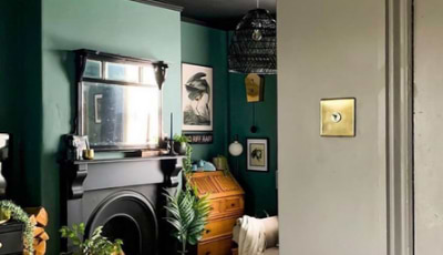
What Colours Go Well With Green?
Green works well as an accent colour or used as a pivotal colour in a room. In this article, we explore the colours that go well with green. -
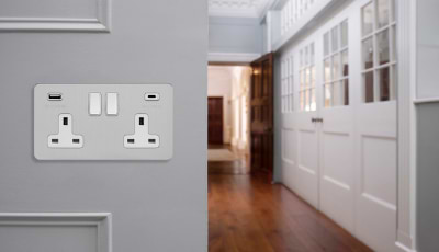
What Are USB C Sockets?
Due to the advancement of technology, sockets have probably had one of the most sophisticated jumps in the power of delivering a fast charge to... -
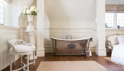
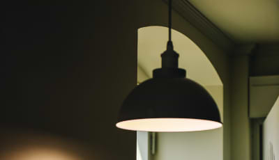
Which Lights Are Best For The Bathroom?
We explore the different types of lights that are best for the bathroom that will allow you to enjoy the space whatever the need. -
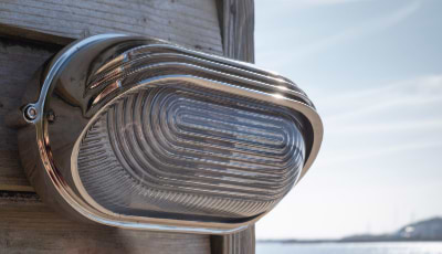
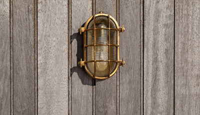
Which Outdoor Lighting Is The Best?
As garden and outdoor gatherings are the new norm, there's never been a better time to select the best outdoor lighting for your space. -
Types of Garden & Outdoor Lighting
To help get your garden summer ready and suitably lit for all the seasons, we take a look at the types of garden and outdoor lighting ideas for your home. -
How To Light Your Garden
To help you get your garden summer ready, we explore the different ways you can light your garden effectively. -
Mood Lighting
Using your lighting scheme to create atmosphere is called 'mood lighting'. Traditionally this can be done in a number of ways which we will explore... -
Types of Outdoor Lighting
We explore the different types of outdoor lighting to get your outdoor space, summer ready. -
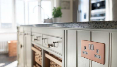
What Sockets Do I Need?
Whether you're in the process of an electrical overhaul or wanting to freshen up some of your electrical points, it can be overwhelming knowing what...