LED lighting continues to be the most popular form of lighting. Whilst there are still both incandescent and halogen bulbs being used in households, with the staggering increase in energy prices, there's never been a better time to make that switch to LED lighting if you are yet to do so.
Whilst the initial cost of LED bulbs is marginally higher, when you look at the life expectancy and the longevity of a LED bulb over time and with the cost savings, LED lighting is a smart move to make. Let's explore the longevity of LED's further.
The lifespan of LED bulbs has always been a huge driver in why people choose LED to light their homes. Compared to their traditional counterparts such as incandescent and halogen, there is a massive jump in the average lifespan as demonstrated on the image below.
Individual LED bulbs offer a whopping average of 25,000 + hours as their lifespan. This is opposed to a traditional incandescent lasting for just 1,200 hours! Using these figures, if an LED bulb was used for 6 hours a day (much more than the average daily usage), then your LED bulb would last for a whopping 7.6 years without the need to be changed. In comparison to a standard incandescent bulb which would only last for 3 months!
Whilst LED bulbs can be slightly more expensive, with hours more use, the cost savings that are created over time will continue to pay for the bulb over, and over again.
Whilst LED bulbs have better longevity, there are still other things that will help to increase the lifespan. Higher than normal temperatures in a ceiling, or roof space creates a lack of airflow around the bulb. This lack of airflow or poorly regulated mains power supply can be detrimental to the lifespan of an LED bulb. This is one of the biggest causes of a reduced lifespan as it creates far more strain on the LED.
Whilst LED bulbs already offer incredible longevity, there are also other ways you can stop the LED's from straining during use. If you have a dimmer switch installed on the circuit, invest in dimmer switches which use soft start technology. This technology enables the dimming settings to be changed in that period. The mechanism causes a slow build up, meaning less strain on the LED and improved longevity of the LED driver. All of our dimmer switches at Elesi feature soft start technology. This means your bulbs can benefit from this each, and every use.
LED bulbs offer longevity and cost savings to a household. Take a look at our full range of LED bulbs to help make that switch today.
[related_products is_auto_added="1"]There’s never been a better time to make that switch to LED lighting. We look at the life expectancy and the longevity of an LED bulb over time along with the cost savings.
Downlights are a great choice for task lighting throughout a house, whether that's over a kitchen worktop, garage or work space. They should only be used where you really need and want to create an even, bright spread of light. So, you've decided what rooms you need them in, but, what about choosing the right downlights? There are many different specifications to consider and understand. You might also be wondering, what are fire rated downlights? And, is this important?
The fire rated specification is an incredibly important part to understand when purchasing downlights for your safety. Let's explore what fire rated downlights are, and what to look for in the buying process.
Downlights are a form of recessed lighting which means they are embedded into your ceiling. Downlights can be placed on the outside of a ceiling, but they are generally embedded where a hole is cut into the ceiling and the downlight is placed.
When a hole is cut into a ceiling/plasterboard this creates a potential channel for fire to quickly spread upwards. This is where a fire rated downlight becomes incredibly important. The fire rating restores the fire integrity of a ceiling once the hole has been cut for the downlight to be fitted. It basically blocks the potential passage and risk by sealing the gap, and slowing the spread of a fire.
To achieve a fire rating, the downlights will have had to have passed a fire resistance test that replicates the behaviour of a fire. The Electrical Safety Council recommend that fire rated downlights should be used in all buildings. They are not legally required, but it is strongly recommended to do so based on the resistance that they provide if a fire was to break out in the property.
Downlights come with different ratings, fire rated to 30, 60, 90 minutes, or all three. The rating of the downlight must match the fire rating of the ceiling, and structure of the building. Generally, fire resistance for a standard home you should be looking for downlights with a 60 minute rating. Whereas a top floor flat may require at least 90 minutes.
Next time you are choosing downlights, take a look at the fire rating specification. If you are not sure what fire rating you need, always consult your electrician beforehand so they can advise.
Whilst fire rated downlights are not legally required in a home, they are strongly recommended to be used, and will provide appropriate measures should a fire ever occur. Explore our full range of LED fire rated downlights.
[related_products is_auto_added="1"]The fire-rated specification is an incredibly important part of downlight safety. Let’s explore what fire-rated downlights are, and what to look for in the buying process.
Cream has always been one of the most popular neutral colours for interiors. This muted colour has the ability to add a blank canvas to a home. Whilst its renown for working with a multitude of different colours for a homely, warm look. It is often favoured over the likes of bright white as it is considered a warmer neutral, and less clinical than plain white.
Although, cream gets a bit reputation for being labelled as being 'boring'. But by combining cream with the right colours it can help lift your interiors. Let's take a look at the colours which go well with cream.
Cream is on the same spectrum as other earth like colours. Because of this, earth green, olive and forest green complement cream really well throughout interiors. This also gives an opportunity to incorporate one, or two more earth colours into the mix, such as brown.
As it's another earthy neutral, brown works harmoniously with cream. Brown is also set to be returning as an interior trend in 2022, so there's never been a perfect time to try it with cream.
Generally, cream will become the base colour in a home, brown can be complemented by using it in decorative accessories and in key pieces of furniture. Focus on wood, and leathers to be in keeping with the natural look.
Adding a nautical influence to your interiors can easily be achieved with cream and navy blue. Try cream walls and add in decorative navy blue accessories, or a geometric navy blue print for a striking contrast. Incorporate other neutral accents and natural furniture for a nautical, natural influenced interior.
If you want to keep things a little bit more neutral, light grey is a great pairing for this neutral favourite. You can afford to feature grey a bit more heavily too as it doesn't need to work as just an accent colour. Cream is considered a warm neutral, and as grey is a cooler colour, this is why the two balance each other well. You could also incorporate a third colour such as taupe seamlessly into this setup.
Of course, we can't forget to mention cream and white. You would definitely need to incorporate other colours into this setup though to avoid it feeling boring, and tired. Cream and white work together well as contrasters, as bright white is just that. This match works well when walls are painted in cream and the ceiling is highlighted in bright white. It gives a sharp contrast, that's clean and brightens the rest of the room effortlessly. Try some screwless White Metal sockets and switches to avoid making this particular colour choice fussy.
Combining cream and pink isn't for the most daring, cream is a great balancing neutral and will tone down the pinkest of accents. Whether it's baby pink or fuchsia pink, cream has the ability to pair well with any hue of pink.
You don't want pink to overpower the room, so it works best when placed as an accent colour against cream, through furniture, textiles and decor accessories.
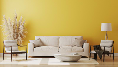
Maybe not canary yellow, but a muted yellow can look fantastic against a cream backdrop. Yellow will help to really draw the warm tones out of cream, whilst helping to uplift the room too. Add a pop of colour by creating a feature wall or even a mural for a gentle touch of yellow.
Cream is a highly versatile neutral that complements a huge range of colours. As it's so versatile, it can be combined with more than one colour for a striking interior.
[related_products is_auto_added="1"]Cream is a highly versatile colour that works well with a multitude of other colours. Let’s take a look at what colours cream goes well with.
Downlights continue to be a great choice for lighting many rooms in a home. Providing task lighting to areas that need it most, with a sleek, unobtrusive finish that works with a range of different interior styles.
When it comes to choosing downlights, it can be quite overwhelming when met with different terms such as colour temperature, lumens, CRI, lux etc. Whilst every feature of a downlight is worth considering, CRI is a feature that should help your buying decision. The wrong CRI can make the objects in your room look a completely different colour. Whilst a low CRI could cause headaches, lack of productivity and even affect your sleep cycle. We explore high CRI downlights and what to look for when purchasing them.
CRI stands for colour rendering index. It is the measurement of how artificial light represents the full colour spectrum of natural daylight. CRI is measured between 0-100, 100 being the highest level. The higher the CRI, the more accurate representation of the colour of objects in a room. This provides greater clarity and precision of tasks.
So, what is considered high CRI downlights? The UK downlight market has always been dominated by low CRI downlights with a CRI of less than 82. Anything above 95 is considered a good CRI level.
In 2021, The Soho Lighting Company launched their range of high >95-97 CRI downlights. Such enhanced levels of CRI are imperative for downlights, providing a well lit space that will aid tasks, rather than hinder them. The improved clarity that high CRI can bring also has the ability to lift your general mood and home life.
Having greater clarity and a truer representation of colour from high CRI downlights brings a number of benefits to a home. High CRI reflects the true colour of objects in the room. This helps to reduce eye strain that can be associated with carrying out tasks in a poorly lit room.
There are also a number of potential health benefits that have been explored, and linked to high CRI. One being the impact on overall mood. Anecdotally and with many studies, it is proven that a sunny day has the ability to lift our moods, and the same can be said for high CRI lighting which is the closest to perceiving daylight as possible. Whereas a poorly lit, orange glow of a light can cause a depleted mood. As well as eye strain and the symptoms associated with that, such as headaches.
Numerous other studies have cited the importance of sunlight on the human body including improved mood, better sleep quality, lower blood pressure and improved productivity. It's time to take a look at your current downlights to check their CRI, and arm yourself with this knowledge next time you are purchasing downlights, or new bulbs.
Take a look at our full range of LED High CRI downlights. They are available in a number of different finishes, all fire rated, with the ability to change the colour temperature to suit your room, and mood.
[related_products is_auto_added="1"]We explore using high CRI downlights in your home, what to look for when purchasing them and the benefits they can bring to your interiors.
With Spring on the way, it's time to start thinking about getting the exterior of your property ready and well lit so you can enjoy the space into the evening. For outdoor and bathroom use, IP65+ rated lighting is recommended to meet with safety regulations, and to keep your home safe.
In this IP rated lighting guide, we explore what IP65 means and the ideal lights for bathroom or outdoor use.
IP stands for Ingress Protection. This is used to determine the levels of sealing effectiveness of electrical enclosures against intrusion from dirt and moisture.
The higher the IP rating, the better protection that it offers against dirt and moisture. When we talk about lighting in bathrooms, think of the bathroom as being split into various water risk zones, as the below image shows.
So, what does IP65 mean? The first digit which is 6 determines the protection against solids, and provides total dust ingress. The second digit determines the protection against liquids with 5 protecting against low pressure water jets from any direction.
In a bathroom, zones 1 and 2 are required to have an IP44+ rating. Generally it is better to go higher, as an IP65 provides better protection against dirt and moisture.
IP65+ is also the preferred rating for outdoor lights. Although, IP45 and above would typically be considered splash proof. If you need Patio or decking lights, we recommend IP65 or above as these areas are often cleaned by using a power washer.
The flaxman bulkhead wall light in nickel lends itself to both bathroom and outdoor use with its nautical, industrial style. The expert hand creation of each light provides a variance in finish which denotes craftsmanship and prestige. IP65 rated, this light will not corrode with exposure to the elements.
Made with real solid brass, the Hopkin IP65 prismatic wall light adds a nautical, vintage edge to an exterior. Perfect for outdoor or bathroom lighting as it will not corrode.
Hand crafted in solid brass with an ungalvanized polished brass finish, this Art Deco wall light is a sophisticated redesign of the original nautical bulkhead, with thick prismatic glass and an IP65 rating.
For a coastal property that is exposed to the elements, a nautical light that provides protection and won't corrode, the Kingly wall light is a smart choice. The brass ages naturally beautifully, but can be brought back to its original finish with a suitable brass polish.
This nautical bulkhead wall light is great for illuminating a larger outdoor space. The soft sheen of the nickel finish lends a contemporary twist on a classic wall light.
The solid brass Carlisle half cover wall light is a sensational light for both bathroom and outdoor use. Adding presence and style, this versatile light is made from hand blown prismatic glass and solid brass for durability.
While zones in a bathroom can take a lower IP rating, it's generally best to go higher to IP65 for better protection against moisture. Take a look at our full range of outdoor & bathroom wall lights to make the most of your outdoor space.
[related_products is_auto_added="1"]In this IP66 lights edit, we explore what IP65 exactly means and the ideal lights for bathroom or outdoor use.
Kitchen islands are a great feature in a kitchen. They help to create a light, airy and more importantly, social space that can be enjoyed by everyone. Your kitchen island or breakfast bar might be ready to go, but without the adequate illumination it won't be the airy open space that you're trying to achieve.
We explore kitchen lighting and how many you should put over a kitchen island.
It is quite subjective as to how many pendant lights should be hung over a kitchen island. Of course, you need to take into consideration the size of the kitchen island and height of the room.
Generally speaking, when it comes to pendants for a kitchen island, breakfast bar, or even dining space, you should think about the rule of odds. This is one of the only exceptions to three's a crowd, because in fact, 3 is the just right amount for lighting! The reason a row of odds of 3, 5, or even 7 work better than singularly or as a pair is because it allows for a harmonious, and well balanced area between the spaces, rather than subjects. This design concept provides a much more visually attractive space than if you were to use evens.
However, there are occasions when just two can look good. But this should be decided by your space, as the rule of odds visually does work better over a kitchen island. A balance of odds will help to disperse and reflect the light evenly throughout the space.
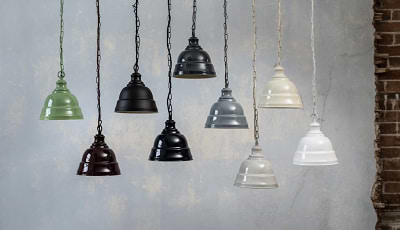
There are lots of gorgeous pendant lighting ideas suitable for use over kitchen islands. Whether you're looking for a colour match to kitchen cabinets or glass lighting to match your decor effortlessly.
Glass is a perfect choice for kitchen islands as it allows for the maximum light output, as well as being both elegant and stylish. The Hollen Acorn lends itself to a pendant light for use over a kitchen island due to the Art Deco style prismatic glass, and works particularly well with brass hardware such as taps or sockets and switches.
The Geo Trapeze is another sensational kitchen island pendant light. A row of three would make an incredible lighting statement in an open plan kitchen setting. The glass helps to disperse, reflect and retract light. Perfect for a kitchen which doesn't get a lot of natural light.
For a chic kitchen space the Cambridge Glass Pendant will create gravitas and presence. The luxurious Cambridge works well as a centrepiece as well as in a row, or above a table, and matches particularly beautifully with rose gold accents.
From our hand painted collection of lights, the Oxford vintage style pendant is perfect for a country style or period kitchen. The enamelled look, with natural subtle imperfections to give the light authenticity and charm. Available in 10 desirable colours.
For a larger kitchen space, the Brewer cage industrial pendant light would look great as a row of odds. The ultimate in industrial styling, this Brewer Cage Industrial Pendant Light in French Grey is hand finished in paint to emulate a timeless enamelled look.
For smaller kitchen islands, the petite Ganton is one of the smallest pendants in our range, but certainly doesn't lack on style! With a charming bell-like shape, the Ganton Vintage Cage Pendant light offers both style and versatility. The cage can be left on or removed, for two slightly different style options.
Take a look at our full range of pendant lights for more kitchen island lighting inspiration.
[related_products is_auto_added="1"]We explore kitchen island lighting ideas, how many you should put over a kitchen island and all about the rule of odds and why it’s important.
It's easy to overlook a stairway in a home without realising how often it gets appraised and used on a daily basis. For this reason alone, it is imperative to look after a stairway and make sure it is well lit. In this blog, we explore how to light a stairway in an unobtrusive, and stylish way.
Lighting a stairway can bring many benefits to a home, both from a practical and aesthetic point of view. It adds visual interest to the space and creates an ambient level of lighting without the need for additional lighting in the hallway.
But, there's no denying that stairway lighting is also a great safety feature for the night or those dark mornings.
There are many different ways you can light a stairway. The way you choose to light your stairway will ultimately come down to your interior style, and your requirements.
The most popular and functional way to light a stairway is with recessed LED lighting. This follows you up the stairs, perfectly lighting each step as you go.
Adding step lighting will enhance your stairs and light those nooks and crannies as they elevate. They can also can be installed in a number of ways to suit your requirements. The most common way is to install them horizontally on the tread of the stairs as shown below. Or they can be installed vertically as the steps rise.
Illuminating each step on a stairway helps to create a level of safety that other light sources just can't provide. This form of stairway lighting is a functional way to light a stairway, guiding you up the stairs at night. Functionality aside, this sleek lighting will blend into most interior styles, and provide gorgeous ambient levels of light during the early evening.
You can also create difference levels of ambience by thinking about the colour temperature of the LED stair lights. Choose warm white bulbs for a cosy, inviting ambience, or cool white bulbs for a brighter look and feel.
Most stairways are adjacent to at least one wall which makes wall lighting a popular, and feasible choice to light a stairway. This can be an effective way to light a stairway, especially when layering with a pendant light or downlights, whilst choosing a decorative finish to suit the interior of the property.
However, wall lights are not an option for everyone and can become obtrusive on a narrow stairway.
Recessed LED lighting provides the sleekest and most accessible way to light a stairway. However, stairwell lighting should still be used in tandem to illuminate the space.
For stairwells that benefit from high ceilings, invest in stairwell pendant lights with a long drop to help illuminate the space, this will avoid dark blind spots throughout.
Glass pendant lights are also a great choice as they will reflect and disperse light evenly, whereas other enamel shades will just direct light downwards.
Lighting a stairway will bring that extra visual impact to a space, whilst guiding you safely throughout the night. Explore our full range of LED stair lights which are available in a wide range of finishes to match the interior hardware of your property.
[related_products is_auto_added="1"]In this blog, we explore how to light a stairway in an unobtrusive, and stylish way with LED recessed stairway lighting and wall lights.
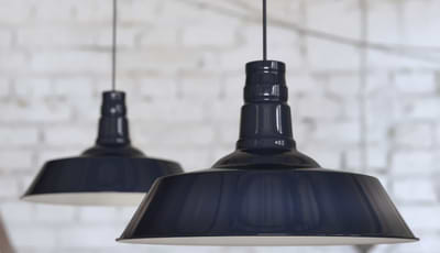
Navy Blue is a highly versatile colour which makes Navy Blue Pendant Lights perfect for the interiors of most homes. This deep, dark shade of blue adds visual interest and contrast to any room.
The beauty of this colour is that it works well with other like colours in the room, whilst it contrasts well with neutrals and other bold colours too. Let's take a look at some navy blue pendant lights ideas for your home.
For a bigger space, the large Argyll style in squid ink navy blue is the perfect light to bring gravitas and impact to a room. This luxurious, deep midnight tone of blue black looks spectacular in both period and contemporary settings.
Add a vintage, classic twist to your interiors with the Portland wall light. The gently curved lines of this light create a soft, vintage look. This luxurious wall light looks great as an alternative to bedside table lamps, use in a home office, living room, or to light a hallway.
The smallest light from our hand painted collection of pendant lights, but just as mighty! The petite Ganton is a charming bell like shape, offering style and character to smaller spaces. Alternatively, they look great as a row of 3 over a kitchen island or dining table.
The smooth curves of the Oxford make it a sleek, and stylish addition to any home. One of the most popular styles in our hand painted range of lights. This version of the light comes with no chain, only a simple and attractive cord. The enamelled look, with natural subtle imperfections to give the light authenticity and charm.
The ultimate in industrial styling, the perfectly formed Brewer industrial pendant light features an elegant horseshoe bracket which holds the light body to the chain. This light is exquisitely soothing to the eye and is handmade to mimic a traditional or period enamelled look.
This beautiful Oxford vintage style wall light in Squid Ink Blue works well with both contemporary and traditional style decors. The smooth, curved body lends a warm retro style to any room, and the enamelled look with natural subtle imperfections gives the light authenticity and charm.
The Portland is a highly versatile and elegant shape for most interiors. It is difficult to go wrong with this classically chic looking pendant, providing the perfect showcase for traditional and Edison style LED light bulbs. This light can be used in hallways, dining rooms, kitchens and bedrooms.
Explore our full collection of Navy Blue Pendant Lights for plenty more inspiration. A great colour for both period and contemporary homes.
[related_products is_auto_added="1"]A highly versatile colour for your interiors. Let’s take a look at some navy blue pendant light ideas for your home.
Peach is a popular colour for interiors, a versatile, soft muted shade that adds a welcome pop of colour and warmth to a space. It's not the easiest colour to blend with your existing interiors, and definitely needs some working in to ensure this colour flows throughout your interiors harmoniously.
We explore what colours go with peach, and complement each other well in your interiors.
As demonstrated above, peach and grey complement each other well, whether that's a pale grey or something more like charcoal for high contrast and visual effect.
They reflect elegance and bring a contemporary look into an interior. Try adding a third colour such as white to help balance the space. These colours are perfect for any room in the house, especially living rooms and bedrooms for a calming effect.
When used in collaboration, these two colours create a soothing effect in the home. Use white as the main foundation colour and incorporate peach as an accent colour. In a bedroom, weave peach in through bedding, throws and pillows. You might want to add a third colour into the mix as another accent colour to create further depth. This could be done with gold for a luxe look, or even with forest green.
This pairing of colours is a very classic colour combination, commonly seen throughout interiors and wedding themes. The gold elements instantly add that luxe, and sophistication to the peach. This will add a rich feel to any room, don't be overbearing with the use and have small doses of each colour running throughout. Brushed Brass is a fabulous choice for sockets and switches in a peach interior.
Forest green is at the other end of the spectrum from light to dark, but opposites to attract, and these two colours work perfectly together. The darker green accent contrasts perfectly with peach. Don't think about conventional interior purchases to bring green in, introduce greenery and plants for a welcome pop of this colour without it being obtrusive in the space.
These two colours can work incredibly effectively together when they are both used as accent colours in the room, especially against a white or cream backdrop. In a child's bedroom, black could be used for wall decals and frames, whilst peach could be introduced with lamp shades, and other pieces of furniture. The result is a cool colour combination which does work well in a child's nursery for a fresh look.
We're not talking about baby blue, although those two colours do work together well in a nursery, or child's bedroom. For a mature stance, combine cobalt blue and peach for a highly luxurious feel. A great pairing of colours for a living space or bedroom.
Peach brings a soothing effect to any interior and it complements many different shades from light to dark. A versatile colour that isn't just destined for a child's bedroom.
[related_products is_auto_added="1"]Peach is a popular colour for interiors. We explore what colours go with peach, and complement each other well in your home.
Choosing the right light bulbs for your fittings is integral to getting the most out of the fixture. Whilst also enhancing and helping to guide your interiors from room to room.
There's more to a bulb than just 'how bright it is'. We have considered lumens vs lux before as important indicators in choosing bulbs, but what about kelvins?
Kelvins are one of the most important vitals of a bulb that tell us what type of light, and ambience the bulb will create. We take a look at both kelvins and lumens of light bulbs and how to compare the two.
Kelvins are the unit of measurement for colour temperature. Colour temperature is the way to describe the appearance of the light which is emitted by the bulb. It might also be used as a way to ascertain what ambience is created by that level of light. Kelvins or (K) or measured from 1,000 to 10,000.
Choosing the right colour temperature is paramount to ensuring you achieve the desired level of lighting and ambience for your home. Each colour temperature has an effect on the colour of the light, and ambience it creates.
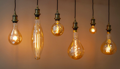
Below you can see the 3 different colour temperatures demonstrated, their kelvin measurement, their colour temperature and the atmosphere it creates.
1800K - at the lowest end of the spectrum 1800k creates a very warm and orangey colour temperature. Perfect for creating a vintage and relaxing ambience. Warm light bulbs are best suited to living rooms or rooms designed for relaxation.
3000k - For a warm and cosy atmosphere, 3000k is the perfect colour temperature for you. Warm white bulbs cover between 2000K - 3000K and have a warm inviting glow, suitable for bedrooms, bathrooms, dining rooms and living rooms.
4100k - this is the closest colour temperature to daylight. Cool white bulbs range from 3100 - 4500K and give off a bluey whiter, brighter light. Suitable for situations and places in which good visibility is needed. It works well in the kitchen, as you'll be able to clearly see the colour of your food. It's also great for garages and workspaces too.
Lumens are arguably one of the most important measurements to look for when choosing light bulbs. They measure the amount of light emitted by the bulb. In simpler terms, how bright the light bulb is going to be.
The higher the lumens, the brighter the light is going to be. The chart below demonstrates the colour a light will emit in comparison to its lumen rating.
When it comes to kelvins and lumens they are both incredibly important measurements which should be considered before choosing bulbs.
Kelvins help us to understand and pick the right type of colour lighting for our home, whereas the lumens tell us how bright the light being emitted is going to be.
Lumens help us to work out how many light bulbs will be needed to adequately light a room, based on the amount of light each bulb emits. There are many calculations that can be done to work this out. This is really important if you are planning your lighting design from scratch.
Use both kelvins and lumens when you are next choosing your bulbs to help create the desired amount of light and ambience in your room. This information is readily available on the packaging of bulbs for your perusal.
[related_products is_auto_added="1"]Kelvins are one of the most important vitals of a bulb that tell us what type of light, and ambience the bulb will create. We take a look at both kelvins & lumens and how to compare the two.